Project
Samsung Health Dashboard & Running Analysis
A Simple but effective dashboard built in Excel using over 3 years of Samsung Health Running Data. This also monitors the users current performance to their own set targets.

Goal
Historic analysis of running data
Skills used
Data Extraction
Data Cleansing
Data Transformation
Exporatory Data Analysis
Excel – Pivot Tables, tables, VLOOKUP, SUMIFS, General formulas
1. Downloading the data set
The first step was using a mobile device to download the data and the zip file extracted to a folder on my computer. I had spent some time researching using an API to pull the data but it appears Samsung have withdrawn this feature for now.

2. Examine Datasets
Samsung Health data is split into over 60 .csv files. I needed to explore the files to establish what data I had and where it was located. I identified the file named with the prefix com.samsung.shealth.exercise to the relevant data.

3. Explore Relevant Data
Exploring the file in Excel shows 61 columns of data Transposed in the image below. I identified and highlighted columns that may be useful for analysis and building the dashboard

4. In Excel I would normally have cleaned the column data at this stage however I decided against it. My reasoning was twofold – I plan to add to the dataset and for convenience it will be easier to upload the new data in exactly the same format and I was also unsure if I would utilise some of the additional data at a later stage.
5. VLOOKUP
I found a list of the exercise codes on the Samsung Developers website and did a VLOOKUP to match the exercises to a new column (Exercise type). I was able to split my running between outdoor running and treadmill running followed by cleaning all other activities (football, swimming etc) from the dataset.

6. Kilometres to Miles Conversion
Admittedly, this step was completed slightly later. Due to the activities being recorded in miles on my device I assumed the same for the data. I realised my mistake (at some point) at corrected it. I transformed the data by reducing /dividing the original KM figure by 1000 to have a KM figure to 2 decimal places. Followed by adding a mile conversion as seen in image 6 below.
7. Review and Pivot Tables
Now I had 3 additional columns. Kilometres (to 2 decimal places), Miles and exercise type. I now felt I was ready to begin reviewing my data in pivot tables and completing some analysis

8. Now I was in a position to manipulate my data, I was able to decide what to show in my dashboard.
I decided it would be useful for any period to see
- Total miles ran
- Longest/Shortest runs
- Miles ran outdoor or/and on treadmill
- Historic yearly targets
- Future targets
9. Selection Controls
The slicer allows for the selection of the exercise type (outdoor running or treadmill) as well as time period ranging from days to years.
I connected the slicer to multiple pivot tables to ensure the whole dashboard updates in sync.

10. Key Metrics
The key metrics dynamically updates depending on the selection controls.
I realised the shortest run field was rather redundant due to exercises either started by accident or times I ran a very short distance to cooldown after stopping the main run.
I went back to the data and cleaned all runs below 0.1 KM but further cleaning will be required or removal of the shortest run field as it provides little value at present.

11. Exercise count and split
I generated some sub-tables and secondary pivot tables to help provide some additional date shown in the donut charts. Again, this dynamically updates based on the selected time period.


12. The distance graph shows the outdoor running and treadmill running in different colours.
Visually you are able to see when Covid hit prompting me to purchase a treadmill for exercise leading to the majority of my running being indoor

13. Future plans
- Consider adding daily step count
- Adjust ‘shortest run’ metric
- Add a ‘run streak’ for days of consecutive runs
- Improve aesthetics
Thank you for reviewing my project. Please see below for more screenshots of the dashboard covering a variety of time periods and exercise types and please get in contact if you would like to provide any feedback.
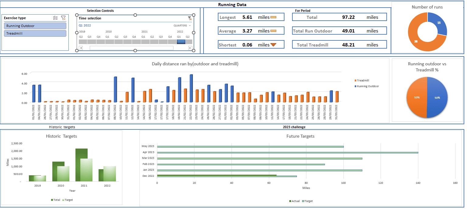
Q1 2022
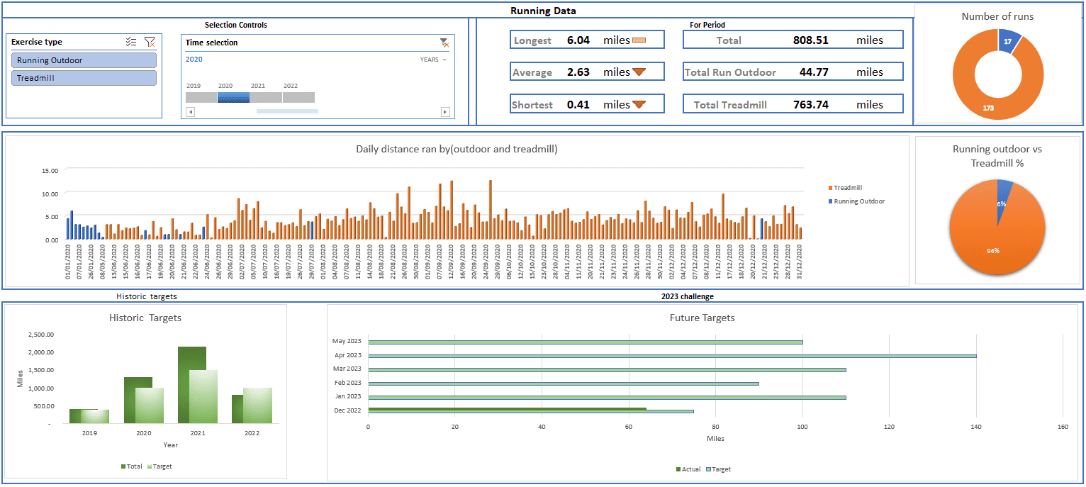
2020 Outdoor and treadmill
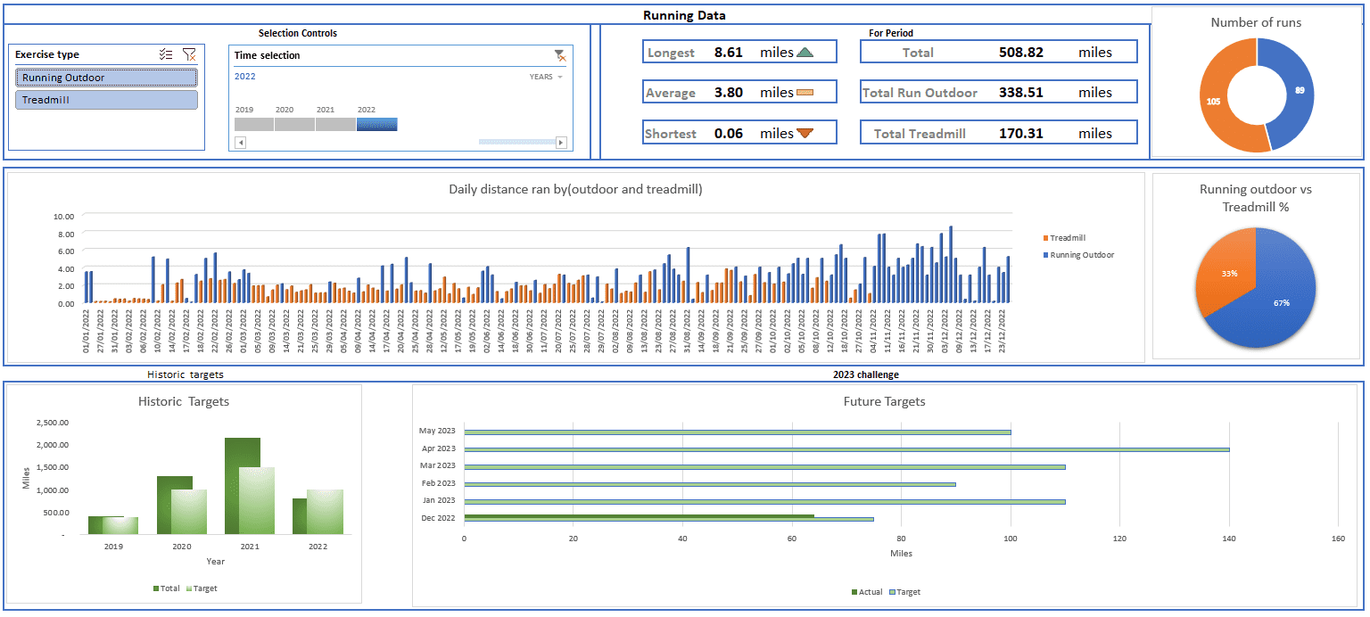
2022 Outdoor and treadmill
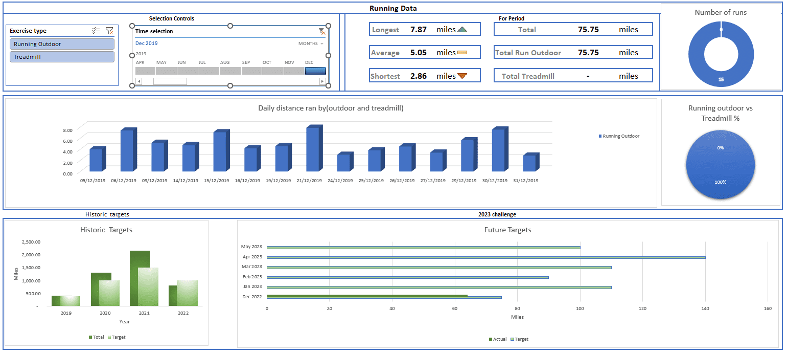
Dec 2019 Running Outdoor
Thanks For Browsing!
Let's Build Something
If you are interested in hiring me for a project, would like to collaborate, or have a question, Just drop me a message.
Darryl Brown
Data Analyst who likes working in Excel, SQL, Python and R I also enjoy building websites using WordPress, HTML and CSS. I love learning about tech